Total: Rs. 0.00
Taxes and shipping calculated at checkout
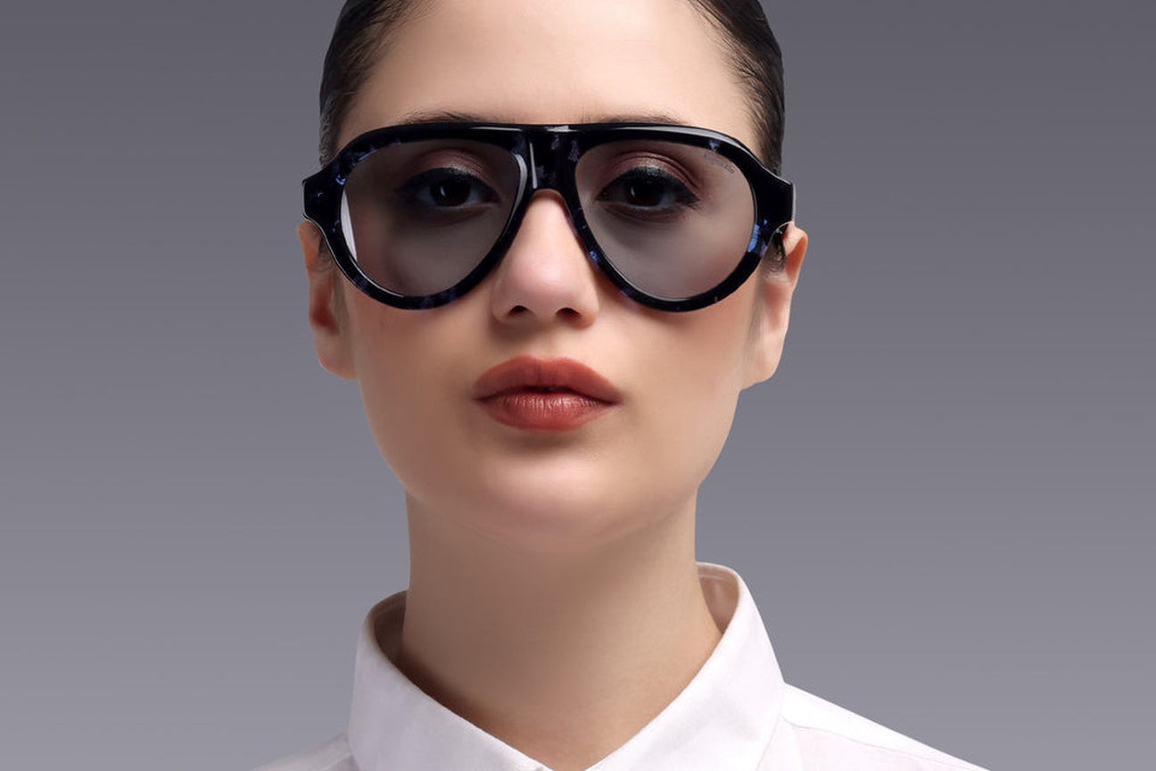
Vortex Havana Blue is Augussto's answer to a design problem most eyewear never attempts: how to make a strong square silhouette - the most assertive register in the vocabulary - carry a classic havana pattern in blue, a colour the tortoiseshell tradition never used, without tipping from confident into loud. The resolution was to treat colour as material, not decoration: a blue that lives inside the layered acetate the way amber lives inside a classic havana, so the frame reads as heritage at first glance and as something entirely new at the second. It is the house's clearest statement that design, not branding, is what you're wearing.
Most eyewear isn't designed; it's selected - picked from a supplier catalogue, badged, shipped. The truth is that nobody can tell you why the frame looks the way it does. We think a house that charges you for design should be able to defend every millimetre of it. So this is the first in a series we'll write for each collection: the actual decisions, the references, the arguments - the anatomy of a design. Vortex Havana Blue goes first, because it was the hardest argument.
Vortex began from the register, not the sketch: the brief was presence - a frame for the man who is looked at more than he looks around, drawn as a strong square with real acetate mass A strong square is the least forgiving canvas in eyewear: there's nowhere to hide a weak line, and mass magnifies every material flaw. Which is exactly why it was chosen. If the house's design conviction was going to be legible anywhere, it would be legible here - in the flat top line, the deliberate corner radii, the temple drawn thick enough to carry the front without competing with it.
A strong square in solid black is safe - and everywhere. The havana pattern was chosen as the frame's anchor in tradition: tortoiseshell is the oldest luxury language in eyewear, the pattern this buyer has seen on every serious shelf from Milan to Tokyo. Putting it on a contemporary square places Vortex in a lineage instead of a trend. But a classic amber havana on this silhouette had a problem: it read as expected. The frame had heritage and presence, and no surprise.
Blue was the argument. The case against: tortoiseshell is warm by definition; blue is cold; a blue havana risks reading as novelty - the one adjective this house cannot afford. The case for: blue is the most fluent colour in a man's wardrobe - the navy suit, the denim, the dial of half the watches this buyer owns - yet almost absent from serious eyewear, abandoned to fashion frames that treat it as surface paint. If blue could be made to behave like a havana - deep, layered, warm in its darks - it would give the fluent wardrobe a frame that matches how this man actually dresses, in a colourway no legacy shelf offers. The condition was absolute: the blue had to live inside the material, in the layered depths of top-grade Italian acetate, with the pattern's translucence intact - colour as strata, never as coating. Tilt a Vortex under light and you see the argument won: the blues shift from ink to azure through the pattern's depth, the way amber shifts in a classic havana. It reads heritage first, new second - in that order, by design.
A frame making one bold argument gets to make only one. Every other element of Vortex was pulled back to let the colourway and silhouette speak: the mark small at the temple, the hardware - German high-precision hinges - engineered to disappear into clean function, the finish polished to depth rather than gloss. This is the discipline that separates a designed object from a decorated one: knowing what the frame is about, and making everything else serve it.
Vortex Havana Blue runs in both volumes. As a sunglass, it's the register at full voice - mass, pattern and colour signalling at range, the pure fashion object this silhouette was always going to be in dark. As an optical, the same design is considered: at conversation distance the blue havana becomes a detail people discover rather than a statement they receive - arguably the more radical way to wear it. Same object, two registers of the same sentence - which is the quiet thesis of the whole house: design deep enough to work at both volumes.
Vortex Havana Blue exists to demonstrate something no spec sheet can: that this house argues about corner radii and colour temperature the way the old standard demands - and then prices the result like an honest object instead of a journey. The old standard of material and design, the new absence of the premium: ₹5,990 with lenses included, lifetime warranty, full price always. Luxury without a premium isn't a slogan on this frame. It's the design brief.
Augussto's design-led strong square: a classic layered Havana pattern rendered in blue within top-grade Italian acetate - colour as material depth, not surface paint - available as both sunglasses and eyeglasses at ₹5,990 with lenses included.
Not when the blue lives inside a layered Havana pattern: at distance it reads as classic tortoiseshell, at close range as something new. As an optical it's a discovered detail; as a sunglass it's a deliberate statement - the same design at two volumes.
That every element is a defensible decision - silhouette chosen for a register, colour built into the material, hardware and branding pulled quiet so one idea speaks. Design-led frames can tell you why they look the way they do; catalogue frames can't.